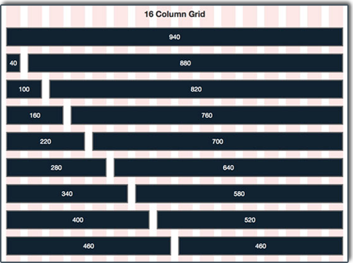
 Recently, I ran across an article on Six Revisions entitled, “The 960 Grid System Made Easy” by Joshua Johnson. I have known about the 960 Grid System for some time now. However, I had yet, up to this point, to implement the system in any of my designs. As I had some time on my hands recently, in between tasks, I decided to give it a shot. After downloading a template Photoshop document as something to work with, laying down the grid guides, it was really easy to implement for WillHull.com.
The CSS code is really simple on the backend as well. The page is laid out into grids within the dimensions of 960 pixels wide. There are two options, a 12 column layout or a 16 column layout; I chose the later. Within my 16 column option, each horizontal spacing has 40 pixels with 10 pixels of space on each side, otherwise known as “gutter space.” Within these dimensions, I am able to play with the width of various things on the page so that they will fit together easily and if I want to change the width, it is only typing in a number on the grid into the CSS stylesheet.

Finally, I decided to give CSS sprites a try in this design. Briefly, a CSS sprite is one graphic rather than several different graphics. The single graphic decreases page load times and exists as a hover function. Sprites can also exist as icons as well (think of social networking icons). You can learn more about what CSS sprites are and how they work on the Smashing Magazine Web site.
Needless to say, the new and improved look of my Web site is aestetically pleasing and easy to manipulate; if I ever wanted to in the future. The look and feel of the site are much the same, however, but I have made significant changes on the backend of the site.
Previously, all of the pages on WillHull.com were located within static HTML pages, updated through an FTP upload. The new location is on the WordPress backend. Each page is, therefore, much easier to update through a Web interface rather than an FTP interface. Although it doesn’t matter to me which way it happens, as long as it happens.
The migration of these pages also improves Search Engine Optimization (SEO) because I am using the Yoast WordPress SEO plugin and as a result all sitemaps and titles for each page are semantically and search engine friendly.
I learned a lot this past week or so, while working on my Web site. I hope I can utilize this knowledge on the job and in future projects where I can expand the scale of my utility to others.
What do you think? Does my Web site look/function better for you?


 Recently, I ran across an article on


