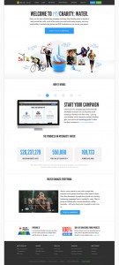
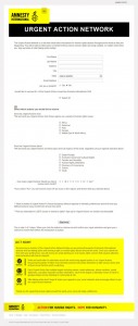
Today, I came across an article that I find worth sharing here at WillHull.com. Over at Unbounce I found an article that dissects 10 nonprofit home pages and/or landing pages. Entitled, 10 Landing Page Examples For the Social Good” this article goes in-depth into really looking at the colors, content and placement of many things that are found on a given webpage. This article claims that many of the pages that they reviewed “are in serious need of some optimization” and “the sad truth is, a lot of these organizations seem to be running landing pages that fall flat.”
When looking at a webpage, visitors often give as little as 8 seconds (also discussed here) to review the page before moving on to another. That being said, we often overlook what we want the visitor to do in exchange for our own emotionally-laden decision to place more and more content onto each and every page, especially the homepage of a site as nonprofit professionals. We have to ask ourselves, what do we want as the outcome of a visitor seeing a given webpage? As much as we like to use the newest and latest technology on our homepage design, sometimes, less is more and “purpose trumps pretty“. “Focus people on what you want them to do, and you’ll get better conversions as a result,” writes Sloan.
All too often, we are measuring outputs rather than outcomes. Outputs are similar to tallies on a chalk board or widgets off of an assembly line. What does counting them do for you? Nothing. However, if you see that they add up to an end result such as these widgets alleviated (x)% of the market need, then you are measuring an “outcome indicator”. Outcomes are the end result we are looking for. If something you are measuring does not contribute to the end result you are looking for, why measure it? We aren’t measuring visitor “hits” to a page just for the sake of hits. We aren’t seeking converstions in the form of donations (in the nonprofit world this is what we would like to focus on often times) but rather what those donation dollars do to impact your mission. We should be seeking a way to measure the end result we are looking for – in the end we want to accomplish the mission of our respective organizations. As such, we need to focus on landing page optimization.
What does your homepage do to accomplish your outcome of a given campaign or mission? You have 8 seconds for the elevator pitch to make or break your relationship with a given supporter. What should you say without being overwhelming?
To optimize a landing page, because let’s face it, your homepage is, in itself, a landing page, you need to play on the KISS principle. “Keep it simple, Sally” (although some like to replace the last word of that phrase with some other language that starts with the letter “s”). How many moving elements are on your homepage? How many colors? How much text? “Tell me where I am and why I should care.” and further “tell me why I should be here, and what I can do” writes Sloan. Think about what “present[s] an opportunity for the visitor to get distracted” and remove it. For example, if you are on a donation page, does it have navigation links or footer links? Are they really necessary or do they distract from what the purpose of the page is?
Calls to action
You need to focus on one call to action on your landing page. You shouldn’t dilute your call to action by presenting more than one opportunity on each page. If you want your visitor to donate, then focus on that and only that. If you want your visitor to sign up for an e-mail update (this could also be phrased as an e-newsletter subscription) then focus on that alone. Keep the call to action “above the fold” meaning before anyone has to scroll down to find it. It should be located at or near the top of the page and easily seen by a catchy headline. Also, if possible, “[g]et the contact information first so you can market to these leads if they do not complete the billing page.” says Sloan. Ways to enhance the call to action might be statistics such as (x)% of every dollar goes to our program focus or (x) million children are starving and each dollar you provide helps feed (x) children; etc. Try to give feedback on what you want the visitor to do and why you want them to do it so urgently.
Sloan goes on in this article by writing, “[i]f you want more conversions you have to make the path to signing up very easy.” I couldn’t have said this better myself. You need to remove as many obstacles as possble to getting the person to hit the, in most cases, “submit” button; although Sloan argues that the use of the word “submit” on a button makes his “blood boil” and he offers a few alternatives. How many fields are on your form asking for an email address? If more than two, you could be jeopardizing the conversion from potential supporter to subscriber. First name and email address will do just fine. The point is to encourage your supporter to commit to sharing information with you without making them feel like they are giving you their Social Security number or credit card information with their PIN numbers.
Just like a first date, you want to assure the other person that you are not taking advantage of their goodwill because they gave you their information. You want to slowly build a relationship with this person. After a person has completed the first name/email address form, you may as a pathway direct them to another form where the first name and email address is already filled out while offering them the opportunity to provide you with more information about them. Perhaps, after they have donated you can direct them to a place they can sign a petition or take an action to write a legislative decision maker. Further, and another way to build trust through communications is to introduce your new supporter through the use of a “Welcome Series” using incremental messaging to slowly introduce your support to how your organization functions, its mission and things that a supporter can do to take action in support of your organization (for example, maybe providing some free printable downloads that they can post in their place of work, school, church or bulletin board to help spread the word about your organization). These options are all possible. However, during your first engagement, you want to keep it as easy to fill out a form as possible. Remove all things competing on your page to keep the visitor from completing that form.
One thing is for certain, landing pages could make all of the difference for your organization. Whether it is your homepage of your organization’s website, a link to a donation page from an email, an advocacy action alert, you need to use the KISS principle in all things that you do with your web marketing medium. Focus on what you want the visitor to do and ask yourself what that action will do to help you achieve your mission.
Does your favorite nonprofit website homepage or donation page meet this criteria or does it distract from its purpose and intent? Leave me a comment, I’d love to hear your feedback.


